관리 메뉴

sookc의 색과 사람들

A WHEEL OF COLOR 본문

sookc의 색과 사람들/권박사 칼럼

A WHEEL OF COLOR

sook'c 2012. 2. 2. 12:05


       권병철 영문학 박사


칼라 이론에 대한 16개 강의를 번역 소개 하려고 합니다.

원천자료의 내용에 충실한 번역을 추구했고
칼라 이론가가 아닌 점을 감안하여 읽으시기 바랍니다.
첨부파일 참고 하세요.
원천텍스트 출처: http://www.wetcanvas.com/ArtSchool/Color/ColorTheory/Lesson1/index.html


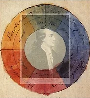
A WHEEL OF COLOR

Starting with rock-bottom basics, make a color wheel. The though of this probably takes you back to sixth grade. But, let me tell you that I have often had very advanced students who could not even explain to me the elements of the color wheel! This is insane. After all, some of the best minds in human history have delved into color wheels -- for example, the great English physicist and mathematician Issac Newton and the German poet and scholar Johann Goethe.


색 바퀴

기본에 기본인 것부터 시작하자면,
색 바퀴부터 만들어 보자. 이것이 당신을 초등학교 6학년 과정으로 돌아가게 할 수도 있을 것이다.
하지만 나는 아주 앞선 단계에 올라있는 학생이 색 바퀴의 요소들을 설명해내지 못함을 종종 보게 된다는 것 또한 말씀드리고 싶다. 이것은 상식을 벗어나는 일이다.
어쨌든 인류 역사에서 몇몇 지성들이 색 바퀴에 천착하였다. 예를 들면 영국의 물리학자이자 수학자인 뉴턴과 독일의 시인이자 학자인 괴테를 들 수 있다
.


Use your colored pencils to match the color wheel to the right (you will likely need to follow the colors according to the ones listed in the small wheel . The colors are not accurate on the web). Bear down hard with your colored pencils to produce the most intense hues possible.


색연필을 사용하여 위 그림의 색 바퀴에 있는 색과 일치시켜 보라. (아마도 작은 바퀴에 등재된 색상에 따라 색을 따라갈 필요가 있을 것이다. 웹상의 색은 정확하지 않다.)  색연필로 가능한 한 가장 짙은 색상을 만들어 낼 수 있도록 각고의 노력을 기울여 보라.


Those of you who know color wheels will see that I have used the usual order for colors on the color wheel. I believe this is the correct placement in terms of the complicated crossover system of the brain, the visual system, and the language of art.


색 바퀴에 대한 지식이 있는 사람들은 색 바퀴에서 색의 일반적이고 보편적인 순서를 따르고 있음을 알아차릴 것이다. 나는 이것이 뇌와 시각체계 그리고 언어영역이라고 하는 복잡하게 교차하는 체계들의 측면에서 정확한 자리배치라고 믿는다.


The left side of an image is addressed by the dominant right eye, which is controlled by the left hemisphere (stay with me on this one; it is complicated!) In the language of art, the left side of an image carries the connotations of dominance, aggression, and forward movement. The right side, scanned after the left side, is addressed by the left eye, controlled by the right brain. The right side of an image, in the language of art, carries the connotations of passivity, defensiveness, and blocked movement.

우성인 오른쪽 눈이 어떤 이미지의 왼쪽 면을 처리하게 되는데 이것은 뇌의 좌반구에 의해서 통제된다.
(
매우 복잡한 주제이므로 설명을 놓치지 마세요.)
언어 영역에서 이미지의 왼쪽 측면은
지배, 공격
그리고
전진의 내포 의미를 동반한다. 왼쪽 면을 훑어보고 난 다음 오른쪽 면은 왼쪽 눈이 처리하고
우뇌가 통제하게 된다. 언어 영역에서 이미지의 오른쪽 면은
수동성, 방어, 폐쇄된 움직임의 의미를 내포한다.


In this zig-zag fashion, the left hemisphere, right eye, and the left side of the color wheel are linked to the sun, daylight, and warmth -- and also to dominance, aggression, and forward movement. Conversely, the right hemisphere, left eye, and right side of the wheel are linked to the moon, nighttime, and coolness -- and thus also to passivity, defensiveness, and distance. Most color wheels are oriented in this fashion, apparently purely on intuition.


이러한 지그재그 패턴에서 좌반구, 오른쪽 눈 그리고
색 바퀴의 왼쪽 면은
태양, , 따뜻함 그리고
또한
지배, 공격, 전진적 이동과 연결되어 있다. 역으로 우반구, 왼쪽 눈 그리고 색 바퀴의 오른쪽 면은 , , 차가움 이런 연유로 또한 수동성, 방어, 거리감 등과 연결되어 있다. 대부분의 색 바퀴는 순전히 직관적인 것에 기초한 이러한 방식으로 구성된다.


The purpose, then, of constructing the color wheel is to set in your mind which colors are opposite each other on the wheel. Blue is opposite orange, red is opposite green, yellow-green is opposite red-violet. These opposites are called complements. The root of the word "complement" is "complete." Perceived in proper relationship, complements seem to satisfy the needs of the right hemisphere and the visual system for completion.


그렇다면 색 바퀴를 구축하는 목적은 바퀴 구도에서
어떤 색이 서로에 대해 반대쪽 편에 해당하는지를
염두에 두기 위함이다. Blue orange의 반대편이고 red green yellow-green red-violet의 반대에 놓여있다. 이러한 반대 측을 보충소라 부른다.
보충소라고 하는 단어의 어근은 완성이다.
적절한 관계에서 지각하면 보충소는 우반구의 필요와 완결을 위한 시각체계를 만족하게 하는 것처럼 보인다.


You can use your color wheel to practice determining which hues are complements. This knowledge should be learned so thoroughly that it becomes as automatic as 2+2 = 4.

어떤 색상이 보충소인지를 결정하는 연습에 당신의 색
바퀴를 활용할 수 있다. 이러한 지식은 아주 철저하게
학습되어 2+2=4 라고 하는 산수 계산처럼
자동화되어야 한다.

AN IMPORTANT POINT: have confidence in your color choices! Guided by some basic left-hemisphere knowledge of the structure of color (for example, the use of complements), your right hemisphere mode will know when the color is right. Within the guidelines, follow your intuition. Try out hues on a scrap piece of paper. Then say to yourself, "Does this feel right?" and listen to what you feel. Don't argue with yourself.

중요한 점: 당신의 색 선택에 자신감을 가져라.
색의 구조에 대한 몇몇 좌반구의 지식 - 예컨대 보충소의 활용과 같은
의 안내를 받아 당신의 우반구 양식(mode)은 언제 색이 옳은 것인지 알게 될 것이다. 기준선(guideline) 내에서는 직관을 따르라.
종이조각 위에다 색을 한번 시험해 보라. 그리고
이것의 느낌이 괜찮은가? 라고 자문하고 자기의 느낌을 경청하라. 말씨름하려 하지 마라.


Bear in mind that color most often "goes wrong" when students without knowledge of color use too many hues. They often throw together a variety of hues, chosen at random from the color wheel. Such combinations are difficult -- if not impossible -- to balance and unify, and even beginning students sense that something isn't working. I encourage you to use a limited palette until you have a wider experience with color.


색에 대한 지식이 없는 학생이 너무나 많은 색상을 사용할 때 대개 색을
그르치게 됨을 명심하라.
그들은 종종 색 바퀴로부터 무작위로 선택한 잡다한 색상들을 쏟아 붙는다. 그러한 색의 조합은 균형을 잡거나 조화롭게 하기가
혹 가능하다손 치더라도- 상당히 어렵다. 그리고 초보 단계의 학생이라고 하더라도 뭔가가 제대로 되어가고 있지 못함을 감지하게 된다. 나는 색에 대한 더 넓은 경험을 쌓기까지는 제한된 색채를 사용하길 권한다.


Having said that, I will reverse the thought and suggest that at some point, you may want to go wild with color, throwing everything together to see what happens. Buy a sheet of brightly colored paper and use every color you have on it. Create discordant color. You may be able to make it work -- or you may like it in its discordant state! Much of contemporary art uses discordant color in very inventive ways. Let me emphasize, however, that you should attempt discordant color by design and not by mistake. Your right hemisphere will always perceive the difference, perhaps not immediately, but over a period of time. Ugly color is not the same as discordant color. Discordant color is not the same as harmonious color.


그렇게 말하고 난 다음에 생각을 바꿔 어느 시점에서는 당신이 어떤 사태가 벌어질지 보려고 모든 색을 같이 쏟아 부으면서 색으로 미친 듯이 법석을 떨고 싶어할지도
모를 것이다. 엷게 채색된 종이를 사고 당신이 가진 모든 색을 그 종이 위에 사용하라.
눈에 거슬리는 색(불협화 색)을 만들어내라.
그 색을 만들어 낼 수도 있고 혹은 또 그 거슬리는 색의 상태 자체를 좋아할 수도 있을 것이다.
대부분의 현대 예술들이 거슬리는 색을 매우 창의적인 방식으로 사용하고 있다. 그러나 제가 강조하고자 하는 점은 단순 실수가 아니라 의도적 계획에 의해 불협화 색상을 시도해야 한다는 점이다. 당신의 우반구는 항상 아마 즉각적으로가 아닌 상당 기간에 걸쳐 차이를 지각할 것이다. 보기 흉한 (ugly)색이 거슬리는 색과 동일한 것은 아니다. 거슬리는 색은 조화로운 색과 동일한 것이 아니다.


To be continued...