| 일 | 월 | 화 | 수 | 목 | 금 | 토 |
|---|---|---|---|---|---|---|
| 1 | 2 | 3 | 4 | 5 | ||
| 6 | 7 | 8 | 9 | 10 | 11 | 12 |
| 13 | 14 | 15 | 16 | 17 | 18 | 19 |
| 20 | 21 | 22 | 23 | 24 | 25 | 26 |
| 27 | 28 | 29 | 30 | 31 |
- sook'c
- 퍼스널 컬러 이미지 메이킹
- 메이크업 학원
- 컬러진단
- 버티는 삶에 관하여
- 인테리어
- 메이크업 배우기
- 메이크업 샵
- MBC 뷰티아카데미
- 울산 메이크업
- 메이크업 아티스트
- 컬러리스트
- 메이크업 강좌
- 메이크업 스쿨
- 웨딩촬영
- 뷰티 컨설팅
- 메이크업 강의
- 섹시 메이크업
- 2012 트랜드
- 봄
- 전문직
- 메이크업
- 강사
- 피부 좋아지는 방법
- 허지웅
- 진로
- 웨딩드레스
- 1950년대 메이크업
- 봄 메이크업
- 퍼스널 컬러
- Today
- Total
sookc의 색과 사람들
도시 경관의 추한 구석에서부터 색 공부를 시작해 볼까요? 본문

LET'S DO AN UGLY CORNER IN A CITYSCAPE
|
|
이제 색 공부를 위해 도시경관을 한번 살펴 볼까요. 밖으로 나가 아주 보기 싫은 구석을 찾아내 보세요. (애석하게도 도시 대부분에서 볼썽사나운 곳은 곳곳에서 쉽게 발견할 수 있습니다.) |

|
|
Read the following directions before you start: Find your corner, the uglier the better. Sit in your car to do the drawing, or use a folding stool to sit on the sidewalk. You will need an 18" X24" board to draw on, and an 18" X24" piece of ordinary white paper. Draw a format edge about an inch from the edges of the paper. Use a pencil to draw the cityscape. A viewfinder and a transparent grid will help in sighting angles and proportions.
시작하기 전 다음 지시사항을 읽어 보세요. 도시의 한구석을 찾아내세요. 18"X24" 크기의 그림판이 필요하고 같은 크기의
Draw negative space almost exclusively to construct the drawing. All details, such as telephone lines, lettering, street signs, and girders, are to be drawn in negative space. This is the key to success in this drawing. Remember that negative space, clearly observed and drawn, reminds the viewer of that for which we all long -- unity, the most basic requirement of a work of art.
When you have finished the drawing, return home and choose a piece of 18" X24" colored paper or colored cardboard. Transfer your on-site drawing to the colored paper, using carbon paper or graphite transfer paper, available in art supply stores. Be sure to transfer your format edge to the colored ground.
Now color it with a complementary arrangement. Choose two colored pencils that harmonize with your colored paper, one dark and one light. Allow the tone of the paper to be the mid-tones. This will provide a satisfying color scheme because the color is balanced. LET'S EXPAND A BIT We have explored complementary color schemes. Two additional ways of arranging harmonious color are monochromatic schemes and analogous schemes. Monochromatic color, meaning variations of a single hue, is an interesting experiment with color. Choose a colored paper and use all the pencils you have in hues related to that color. Analogous color is an arrangement of hues close to one another on the color wheel -- red, orange, and yellow; blue, blue-green, and green, for example.
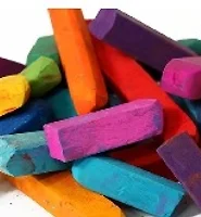
단색 즉 단일 색조의 변이형을 의미하는 것으로 유사 계열 색은 예를 들면 red, orange, yellow와 blue, blue-green, green과 같은 색 바퀴에서 서로 근접한 유사계열의 색조를 배열하는 것이다. MOVING ON TO A PASTEL WORLD 파스텔의 세계로…. Your next purchase should be a set of pastels, which are pure pigments pressed into round or square chalks using a minimum of binder. You can buy a basic set of twelve chalks (ten hues plus black and white) or a larger set of up to one hundred hues. But be assured that the small basic set is sufficient for the exercises we will do here. So run out and buy a set of pastels and I will meet you back here in a few days. We are now beginning to move into the really fun part of learning color. It will be exciting. See you..
|


'sookc의 색과 사람들 > 권박사 칼럼' 카테고리의 다른 글
| The History of Color (색의 역사 1) (0) | 2012.05.09 |
|---|---|
| 파스텔의 세계로.. (0) | 2012.03.30 |
| 뇌와 색 이야기 (0) | 2012.02.09 |
| A WHEEL OF COLOR (0) | 2012.02.02 |
| Lessons in Color Theory (0) | 2012.02.02 |